
Researchers today can write entire papers with the help of AI, run experiments faster than ever before, and summarize books in minutes. Yet one stubborn bottleneck remains: creating clear, publish-ready drawings. Poor graphics look useless and can obscure ideas and weaken the impact of the paper. Google now seems to have a solution to this – and it’s called ‘PaperBanana.’
From architectural models to workflow pipelines, publication-ready visualizations still require hours in PowerPoint, Figma, or LaTeX tools. Furthermore, not every researcher is a designer. This is where PaperBanana comes into the picture. Designed to convert text descriptions into clean, readable visuals, the system aims to automate one of the most time-consuming aspects of research communication. Instead of drawing figures by hand, researchers can now define their methods and let AI handle the visual interpretation.
Here, we examine PaperBanana in detail, what it promises, and how it helps researchers in general.
What is PaperBanana?
At its core, PaperBanana is an AI program that converts text descriptions into publication-ready course diagrams. Instead of manually drawing workflows, architectural models, or test pipelines, users can describe their approach in plain language in PaperBanana. Quickly produces clean, organized visuals suitable for research papers, presentations, or technical documents.
Unlike typical AI image generators (check out the top 2026), PaperBanana is specifically designed for scientific communication. Understands the principles of academic mathematics, clarity, logical flow, labeled components, and readability. With this, it ensures that the output focuses on a professional look rather than a decorative idea.
Google says the system can generate a range of visualizations, including schematic diagrams, system pipelines, statistical charts, conceptual diagrams, and even polished versions of complex diagrams. In short, with a focus on accuracy and design, PaperBanana guides the way researchers present complex ideas visually.
But this use case would understandably put it closer to an AI image generator.
So how is it different from AI Image Generator?
At first glance, it may seem that PaperBanana is just another AI image generator. After all, it shares a very similar name with the popular NanoBanana, also by Google. And the fact that tools like DALL·E, Midjourney, and Stable Diffusion can also create amazing looks from text recognition adds to the similarity.
But understand this – scientific drawings are not art.
They want accuracy, logical structure, correct labels, and reliable representation of processes. This is where AI image generators fail.
PaperBanana is built with precision at its core. Instead of “drawing” what looks right, focus on what is structurally and scientifically correct. It preserves relationships between components, maintains a logical flow, and ensures that labels and annotations reflect the defined path.
In charts and plots, it goes further. Generates visualizations by rendering code-based to ensure numerical accuracy rather than balanced visibility.
In summary:
- AI image generators optimize beauty.
- PaperBanana optimizes for accuracy and clarity.
That difference makes all the difference in academic and technical communication.
How PaperBanana works
PaperBanana works as a group of five agents, not a single “image generating” model. These five agents operate in two different stages after receiving two types of input from users. The input types are –
Source(s): content of your paper/description of method
Purpose of communication (C): what do you want the figure to say (eg, “show the training pipeline”, “describe the structure”, “compare methods”)
From there, PaperBanana operates in two phases:
1) Line Planning Phase (Planning Agents)
- Recovery agent pulls relevant reference examples (E) from the reference set (R) – basically: “What do good academic drawings like this usually look like?”
- Then i Planning agent it converts your context into a preliminary drawing definition (P) — a systematic plan of what should appear in the drawing and how it should flow.
- Next, i Stylist Agent uses academic aesthetic guidelines (G) learned from those references, and produces a prepared definition (P*). This is where it starts to look like a clean, publication-style person—not a random infographic.
2) Iterative Refinement Loop (Agents improve it by rotation)
- Now i Visualizer Agent you turn that advanced definition into real output:
– can be a drawing/photograph (Iₜ)
– or executable code (for plots / charts) - Then i A critical agent it logs in and checks the output against the source context for authenticity (are the labels correct? is the flow correct? is something established?). Based on the criticism, the system generates a refined definition (Pₜ₊₁) and re-rides.
This uses T = 3 cycles (as shown), and the final result is the final image (Iₜ).
In one line: PaperBanana doesn’t “draw” – it organizes, styles, generates, analyzes, and filters like a real academic workflow.
Benchmark Performance
To test its effectiveness, the authors introduced PaperBananaBench, a benchmark built on real paper NeurIPS calculations, and compared PaperBanana against traditional image generation methods and agent bases.
Compared to the direct information of graphic models (“vanilla” generation) and less information, PaperBanana greatly improves the reliability, readability, and overall quality of the drawings. When paired with Nano-Banana-Pro, PaperBanana achieved:
- Reliability: 45.8
- Dimensions: 80.7
- Readability: 51.4
- Beauty quality: 72.1
- Total score: 60.2
Contextually, vanilla image generation methods scored the lowest in accuracy and structural readability, while human-generated graphics averaged a total score of 50.0.
The results highlight PaperBanana’s core strengths: producing graphics that are not only visually appealing but also structurally reliable and easy to understand.
Examples of PaperBanana in action
To understand the true impact of PaperBanana, it helps to look at what it actually produces. The research paper shows several diagrams generated directly from the method descriptions, showing how the program translates complex workflows into a clean, publication-ready view.
From pipeline models and system architectures to workflow analysis and concept diagrams, the output displays a level of structure and clarity that closely mirrors the calculations found in high-level conference papers.
Below are a few examples produced by PaperBanana, as shared within the research paper:
Roadmaps
Statistical Sites
Refinement of beauty
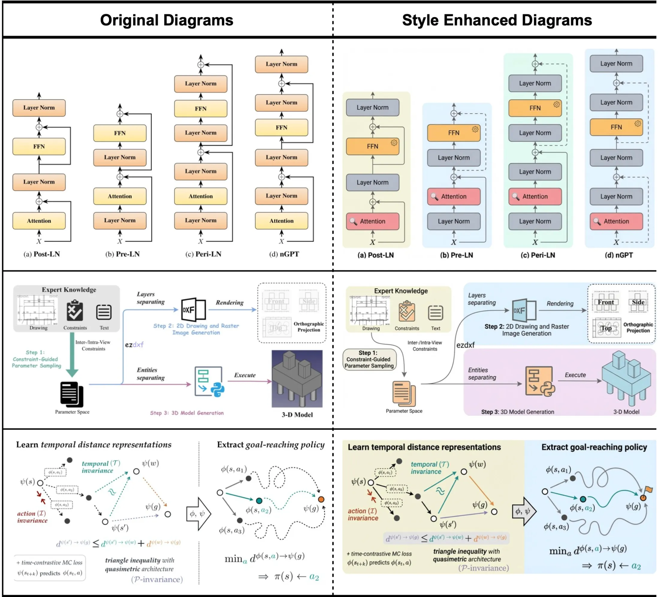
Image and content source: Google’s PaperBanana Research Paper
The conclusion
PaperBanana tackles a surprisingly stubborn problem in modern research workflows in a beautifully novel way. The idea of combining retrieval, editing, styling, production, and criticism into an organized pipeline seems very clever indeed. And the fact that it produces graphics that prioritize accuracy, clarity, and academic readability over visual appeal proves its worth.
More importantly, it represents a broader change. AI is no longer just about helping to write code or summarize papers. It is beginning to help in the communication of science itself. As research workflows become increasingly automated, tools like PaperBanana can eliminate hours of manual effort while improving the way ideas are presented and understood.
Sign in to continue reading and enjoy content curated by experts.


